Supermarket Sidekick
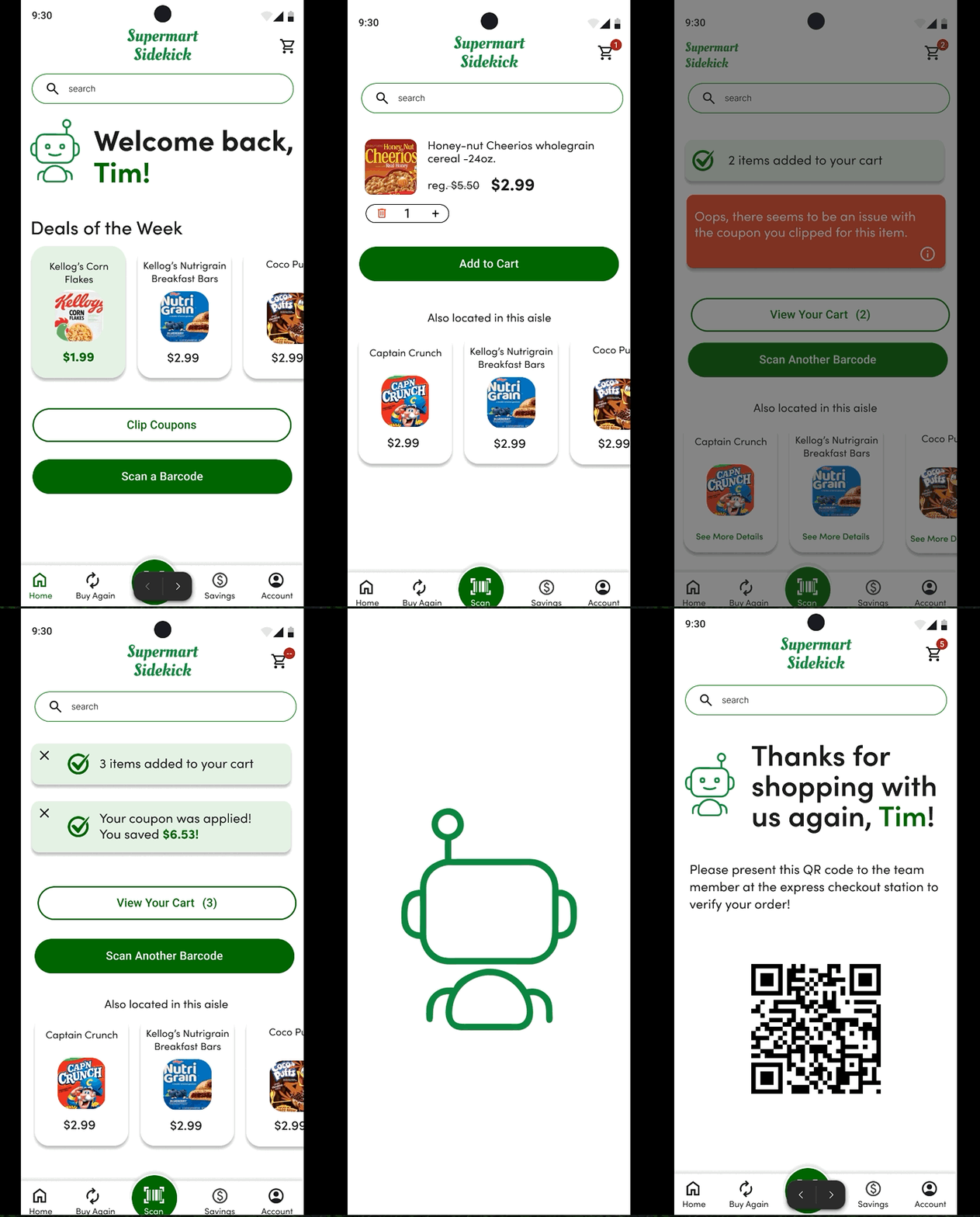
A digital product designed to solve the numerous problems associated with self checkout kiosks found at grocery stores.

Rethinking Self Checkout
Refining the self-checkout process at grocery stores, with user goals’ at the front and center.
Duration: 3 months
Key Skills: Ideation, Interviews, User Stories, Empathy Maps,
User Flows, Journey Mapping, Sketching, Wireframing, Prototyping, and Visual Design

The Problem:
39 years after its introduction, many companies are scaling back or even doing away with self-checkout. Negative user experience, theft, and a poorly trained workforce are all factors in the decline.

But What If:
Instead of getting rid of the self-checkout process all together, we take a long, hard look at who these people are who use self-checkout, what they want from the process, and what solutions might be available to make it more streamlined, delightful, and user-centric.

And So:
I created the idea for an app, Supermart Sidekick, that would attempt to empower the user to grocery shop at their own pace and make sure things are done correctly.


Key Features
In-store Scanning:
Enable uses to scan items and add them to their cart while shopping in the store.


Coupon Feedback:
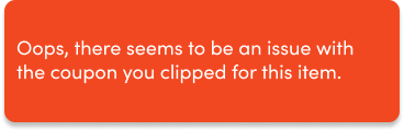
Give users instant feedback on coupons that they have clipped, and alerting them to coupons available that they may have missed.

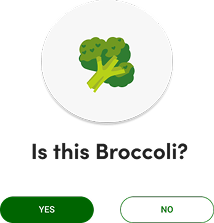
AI Powered Image Recognition for Non Barcoded Items:
Instead of trying to navigate the confusing UI of the traditional self-checkout kiosk, users can use these new kiosks to identify items

The Research

Interviews:
The first step was to find out what users thought about the current self checkout process.
I selected 3 participants for an in-depth interviews. These were some of the key findings.
#1
Error prone kiosks, exacerbated by a lack of staff to available to assist when these issues arise:
“So they're extra sensitive machines, when you need, you know, a staff member to help that person is like actually checking out another person's groceries.”
-Joohee Mather on issues she has had with a specific self-checkout kiosk
#2
Coupons that have been clipped do not work, causing a delay at checkout:
“I once had to go the customer service counter, because it was like $28, with all of the coupons that either didn’t read or I was overcharged.”
-Valerie Vinyard on being accidentally overcharged due to a system error regarding her coupons.
#3
Confusing UI to look up non barcoded items:
“Trying to find the right apple I’m trying to buy among five different varieties can be a hassle. Plus, some of them don’t have PLU numbers, or the PLU numbers don’t work.”
-Tyler Lowe on the confusing UI he encounters at the self checkout kiosks..

User Personas
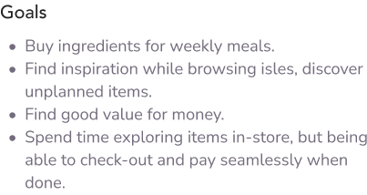
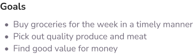
After conducting the interview, I created 2 user personas that I felt reflected the user I was designing this solution for.



Empathy Maps
In order to put myself in the mind of my end user, I created an empathy map to capture what they say, do, think and feel.

Says:
“I like the autonomy of (self checkout). I like that I can bag things the way I want it bagged. And I typically don't do huge grocery trips. So it's not like super inconvenient for me to use it.”
Does:
Uses grocers store app to clip coupons for in-store shopping.
Thinks:
She appreciates being able to clip coupons virtually without having to physically cut and carry them
Feels:
Would like to see more customer service in the stores, especially if the staff are no longer scanning items. Like at Costco, where staff members approach customers waiting in line to scan their items.

Empathy Maps
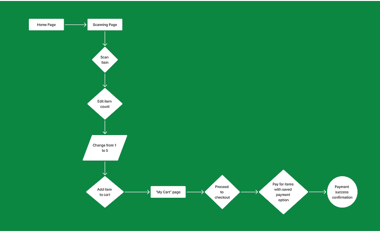
The next step was to diagram the red-route user flows that could make or break the usability of the app.
Scanning an item, editing the quantity, adding item to the cart, and completing the checkout process.

Sketches
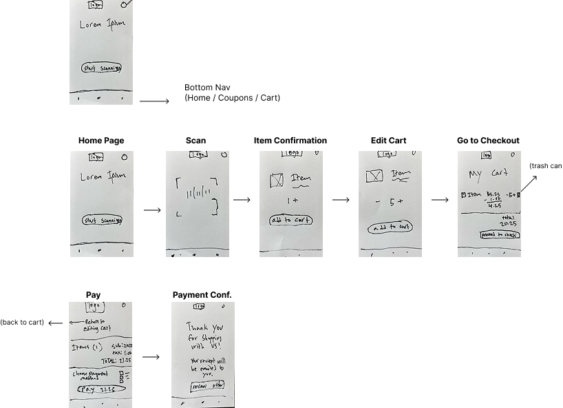
In order to get a sense of how the app’s UI might look, I made some rough sketches of the essential screens.

Wireflows
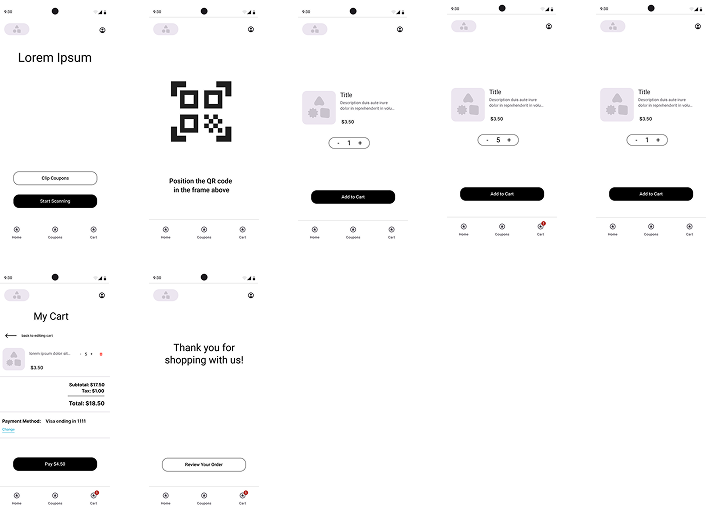
Next, I created some lo-fi wireframes to further flesh out the design

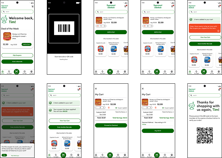
Hi-Fi Screens
Now that I had mapped out the main UX of the red-route, I was able to fully develop the UI elements. During this faze of the design process, I also added some features that dealt with coupon verification.

Testing and Iterations
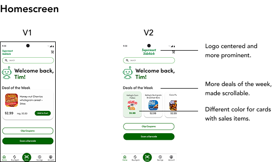
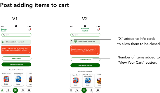
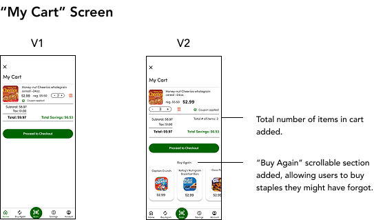
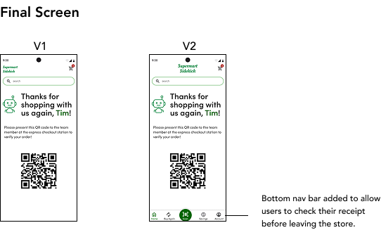
My favorite part, it was time to test out my product. After 2 rounds of testing, I made some key changes to the UX and UI.
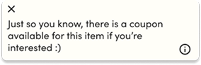
In addition, one of the test participants asked about scanning an item that has a coupon available that had not been clipped. As coupon verification is a vital part of the app, I designed an info card for it.

In Conclusion
By taking a deep dive into the needs of the users and the pain points they were experiencing at the self-checkout kiosks, it is my hope that Supermart Sidekick can give users the confidence to grocery shop on their terms.
